Negative Space
Tech Terms Daily – Negative Space
Category — GRAPHIC DESIGN
By the WebSmarter.com Tech Tips Talk TV editorial team
1 | Why Today’s Word Matters
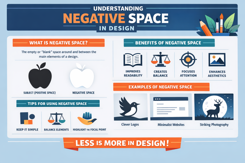
In graphic design, what you don’t put on the page can be just as important as what you do. Every designer learns early that visuals, text, and colors are crucial, but negative space—the empty or unused areas around elements—can transform a design from cluttered and overwhelming to elegant and impactful.
Negative space (also known as white space) isn’t wasted space. It’s an intentional design choice that helps guide the viewer’s eye, create balance, and improve readability. Brands like Apple, Nike, and FedEx have used negative space masterfully to craft iconic logos and layouts that feel timeless and sophisticated.
In 2025, when digital platforms compete for milliseconds of user attention, negative space is more than a design principle—it’s a strategy. By allowing breathing room in your design, you improve focus, usability, and brand perception. Ignoring it often results in designs that feel chaotic, confusing, and amateur.
2 | Definition in 30 Seconds
Negative Space (Graphic Design):
The unmarked or empty space surrounding and between design elements—used intentionally to improve visual balance, highlight focal points, and enhance clarity in a composition.
It answers four critical design questions:
- How can I make my design feel clean, organized, and professional?
- Where should I guide the viewer’s attention first?
- How do I improve readability without removing important content?
- How can I use minimalism to make my message stronger?
Think of negative space as the pause in a conversation—it gives your audience time to absorb and appreciate what’s being said.
3 | Why Negative Space Is Critical in Graphic Design
| Without Negative Space | With Negative Space |
| Overcrowded layouts that overwhelm the eye | Clear, balanced designs that feel easy to navigate |
| Lower readability for text-heavy designs | Improved legibility and comprehension |
| Viewers miss key focal points | Attention naturally drawn to important elements |
| Amateur or dated appearance | Professional, modern aesthetic |
| Higher bounce rates in digital experiences | Increased engagement and time-on-page |
4 | Types of Negative Space
- Active Negative Space – Deliberately designed to lead the eye and create harmony.
- Passive Negative Space – Naturally occurring empty areas that still benefit the design.
- Micro Negative Space – Small gaps between lines, letters, or icons to improve clarity.
- Macro Negative Space – Large empty areas in layouts or around key focal points for emphasis.
- Hidden Negative Space – Shapes or symbols formed within the empty areas of a design (e.g., the arrow in the FedEx logo).
5 | Five-Step Blueprint for Using Negative Space Effectively
- Identify the Focal Point
- Decide what you want the audience to notice first, and clear surrounding space to emphasize it.
- Decide what you want the audience to notice first, and clear surrounding space to emphasize it.
- Simplify the Layout
- Remove unnecessary elements that distract from the message.
- Remove unnecessary elements that distract from the message.
- Balance Positive and Negative Space
- Avoid extremes—too much empty space can feel barren, too little feels cramped.
- Avoid extremes—too much empty space can feel barren, too little feels cramped.
- Use Grid Systems
- Organize your content and spacing consistently to create a natural flow.
- Organize your content and spacing consistently to create a natural flow.
- Incorporate Hidden Design Elements
- Use creative negative space to add subtle brand touches or hidden meanings.
- Use creative negative space to add subtle brand touches or hidden meanings.
6 | Common Mistakes (and How to Fix Them)
| Mistake | Negative Effect | Quick Fix |
| Treating negative space as wasted space | Cluttered, overwhelming visuals | See it as a design element with purpose |
| Overfilling layouts to “use all the space” | Poor readability and focus | Remove non-essential elements |
| Inconsistent spacing | Uneven, chaotic visual flow | Use consistent margins, padding, and grids |
| Ignoring mobile design | Crowded small-screen experiences | Increase spacing for touch-friendly designs |
| Too much negative space without balance | Feels empty or incomplete | Use focal points and typography to anchor the design |
7 | Advanced Negative Space Strategies for 2025
- Minimalist Branding – Use ample space with strong typography for a luxury, high-end look.
- Interactive Negative Space – In web and app design, let whitespace respond to user interactions (hover effects, scroll animations).
- Photography Integration – Use background space in images to overlay text or logos without clutter.
- Contrast Play – Pair bold color blocks with neutral negative space to make calls-to-action pop.
- Illusion Design – Create double-meaning imagery using the shapes formed by empty space.
8 | Recommended Tool Stack for Working with Negative Space
| Purpose | Tool / Service | Why It Rocks |
| Graphic Design | Adobe Illustrator | Precise control over layout and spacing |
| Layout & Prototyping | Figma, Sketch | Easy to test space balance in responsive designs |
| Typography Design | Adobe InDesign | Professional control over micro negative space in text |
| Web Development | Webflow, Elementor | Visual control over spacing without coding |
| Inspiration | Behance, Dribbble | Explore creative uses of negative space by top designers |
9 | Case Study: Boosting Conversions with Negative Space
A WebSmarter.com client—a boutique jewelry brand—was struggling with low engagement on their e-commerce homepage.
Before:
- Crowded product images and promotional banners.
- Text overlays were hard to read due to busy backgrounds.
- Visitors quickly scrolled past featured products.
After WebSmarter’s Negative Space Optimization:
- Reduced homepage content to one main hero image with 40% negative space around it.
- Enlarged product images and increased white margins for a cleaner gallery.
- Simplified typography and spacing for product descriptions.
Result:
- Bounce rate decreased by 26%.
- Average time on page increased by 42%.
- Online sales rose 18% within the first month after the redesign.
10 | How WebSmarter.com Makes Negative Space Turnkey
- Design Audits – Evaluate existing layouts for overcrowding and spacing issues.
- Brand Alignment – Match negative space usage with your brand’s style and tone.
- Responsive Layout Design – Ensure optimal spacing across desktop, tablet, and mobile.
- Conversion-Focused Layouts – Use negative space to highlight CTAs and key products.
- Creative Integration – Incorporate hidden elements or brand symbols into negative space for memorable design.
11 | Wrap-Up: The Power of What’s Not There
Negative space isn’t a blank gap to be filled—it’s an active design tool. It creates visual breathing room, directs attention, and elevates a brand’s overall aesthetic. In both digital and print design, mastering negative space can make your work look more polished, professional, and persuasive.
With WebSmarter’s expertise, you can harness negative space strategically—turning empty areas into powerful storytelling devices that guide viewers exactly where you want them to go.
🚀 Book your Negative Space Design Consultation today and let your layouts speak volumes through the art of what’s not there.


You must be logged in to post a comment.