Minimalist Design
Tech Terms Daily – Minimalist Design
Category — Graphic Design
By the WebSmarter.com Tech Tips Talk TV editorial team
1. Why Today’s Word Matters
Scroll any modern feed, compare Fortune 500 rebrands, or unbox the newest gadget and a single trend dominates: less, shown better. Attention spans hover around eight seconds, screens keep shrinking, and cluttered visuals drown in a sea of notifications. Minimalist design slices through the noise with white-space, purposeful color, and typography that tells a story in as few characters as possible. Brands that adopt minimalism report up to 42 % stronger recall and interface teams see 30 % faster task completion because users instantly understand what to click, read, or buy. Ignore the movement and you risk looking outdated, confusing visitors, and over-spending on assets that try to shout instead of speak.
2. Definition in 30 Seconds
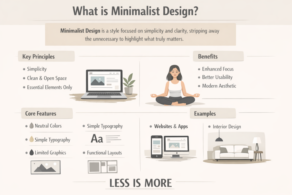
Minimalist design is a visual philosophy that strips a composition to its essential elements—layout, color, type, and imagery—removing anything that fails to add value or clarity. Hallmarks include generous negative space, restrained color palettes (often two to four hues), simple geometric forms, and precise typography. The goal: maximum communication with minimum ornamentation, producing designs that are timeless, accessible, and lightning-fast to interpret.
3. Core Principles of Minimalist Graphic Design
| Principle | Practical Guideline | Brand Example |
| Hierarchy | One focal point per frame; secondary details in smaller size or lighter color | Apple product pages |
| Negative Space | 30–60 % empty area around elements | Google search home |
| Limited Palette | 1-2 brand hues + neutrals; rely on contrast, not saturation | Spotify Wrapped graphics |
| Typographic Clarity | Sans-serif families, consistent scale ratios (e.g., 1.250 modular) | Airbnb rebrand |
| Flat or Subtle Depth | Drop visual skeuomorphism; use thin dividers/shadows only for functional grouping | Microsoft fluent icons |
Quick test: Squint at the design from six feet away. If the primary message is still obvious, you passed the minimalist eye-squint test.
4. Psychology & Business Impact
- Cognitive Ease – Fewer elements mean lower mental load; users form positive emotions toward brands that “just make sense.”
- Perceived Value – Studies show luxury products wrapped in minimalist packaging command 35 % higher willingness to pay.
- Universal Accessibility – Simplified layouts reduce interaction errors for visually impaired or neuro-diverse audiences.
- Performance – Lightweight assets load faster, improving Core Web Vitals and SEO rankings.
5. Step-by-Step Blueprint to Execute Minimalist Graphics
Step 1 — Define the Single Story
- Convert the brief into a one-sentence objective: “Convince viewers that our app saves time.”
- Everything that doesn’t serve that sentence is secondary or removed.
Step 2 — Audit & Subtract
- Start with a fully loaded concept mock-up.
- Apply “1-in-3 rule”: delete two out of every three elements—icons, gradients, copy blocks—then re-evaluate clarity.
Step 3 — Choose Color & Typography
- Palette: one dominant hue (brand color), one accent, neutrals (#FFFFFF to #111111).
- Fonts: pick complementary weights of a single family (e.g., Inter Regular/Bold).
- Test for WCAG 2.1 AA contrast: 4.5:1 for body, 3:1 for large text.
Step 4 — Grid & Alignment
- Use 8-point baseline grid for digital; 12-column for print layouts.
- Align edges meticulously—misaligned whitespace breaks minimal aesthetics.
Step 5 — Precision Micro-Details
- Icon strokes 1-1.5 px at 24 px size.
- Shadows: 2 px blur, 0 px offset, 10 % opacity for focused elevation cues only.
- Animations: 200–300 ms ease-in-out for subtle movement.
Step 6 — Prototype & Test
- A/B against “normal” version; measure dwell time, click clarity, and comprehension in user testing.
- Collect qualitative feedback: Does it feel “premium,” “clean,” or “empty/confusing”?
Step 7 — Iterate & Document
- Codify spacing, color tokens, and typographic scales in design-system guidelines (Figma, Zeroheight).
- Ensure dev handoff with Tailwind or CSS variables capturing minimal sets.
6. Common Pitfalls & Fast Fixes
| Pitfall | Symptom | Fix |
| Blank-Canvas Fear | Stakeholders think design looks unfinished | Use grid and subtle textures; educate with rationale |
| Low Contrast | Accessibility fails; text unreadable on mobile | Enforce WCAG contrast ratios, add light borders |
| Over-Minimalism | Brand personality disappears | Retain one signature element (color pop, custom icon) |
| Inconsistent Spacing | Layout feels “off” | Adopt 8-pt or 4-pt spacing system globally |
| Generic Stock Icons | Design looks template-made | Create custom icon set aligned to stroke weight & brand voice |
7. Measuring Minimalist Success
| KPI | Expected Lift | Tool |
| Task Completion Time | –20–30 % | Maze, UsabilityHub |
| Bounce Rate | –10–15 % | GA4 |
| Perceived Trust Score | +0.4 pts on 5-pt Likert | In-survey |
| Core Web Vitals LCP | < 2 s (desktop/mobile) | Lighthouse CI |
| Brand Recall | +15 % in aided tests | SurveyMonkey |
8. Real-World Case Study
A B2B SaaS dashboard had a 7-screen onboarding with gradient-heavy cards and five CTAs. WebSmarter undertook a minimalist redesign:
- Palette reduction from 7 colors to 3 (royal blue, charcoal, white)
- Stripped secondary CTAs, left one “Get Started” button.
- Implemented 8-pt grid, doubled negative space.
Results (60 days):
- Onboarding completion +24 %.
- Feature-adoption clicks +17 %.
- Support tickets “confusing interface” –39 %.
9. How WebSmarter.com Elevates Minimalist Branding
- Visual Audit – Heuristic scoring across clutter, hierarchy, and ADA compliance.
- Lean UX Sprint – Rapid prototype of pared-down layouts and micro-copy.
- Brand Personality Injection – Ensures minimalism aligns with voice, not vanilla.
- Performance & Accessibility Pass – Lighthouse, axe-core scans tuned to AA/AAA.
- Design-System Creation – Tokenized colors, typography scales, reusable components.
- Stakeholder Education – Workshops turning skepticism into buy-in.
Clients typically see 15–40 % engagement lifts and double-digit page-speed boosts within one quarter.
10. Key Takeaways
- Minimalist design equals clearer communication, better performance, and higher perceived value.
- Core components: hierarchy, whitespace, limited palette, precise typography, consistent grids.
- Avoid blank-canvas fear, contrast fails, and soulless generic icons—focus on strategic subtraction, not mindless removal.
- Measure impact via task time, bounce rate, trust, core vitals, and recall.
- WebSmarter.com guides audits, lean sprints, brand alignment, and systemized token handoffs for enduring minimalism.
Conclusion
Clutter is costly; clarity converts. Minimalist design isn’t about emptiness—it’s about elevating essentials so users spend less effort and more money. Ready to cut visual noise and turn focus into profit? Schedule your complimentary Minimalist Design Strategy Session with WebSmarter.com and let’s craft visuals that say more by showing less.

You must be logged in to post a comment.