Responsive Images
Tech Terms Daily – Responsive Images
Category — WEB DESIGN & DEVELOPMENT
By the WebSmarter.com Tech Tips Talk TV editorial team
Why Today’s Word Matters
Mobile now accounts for roughly 63 % of global page views, yet the average webpage still ships heavy, desktop-sized images down shaky 4G connections. That single mis-sized hero photograph can add half a second to Largest Contentful Paint (LCP)—enough to drop your Core Web Vitals score into the “Needs Improvement” zone and tank search rankings. Meanwhile, 5- and 6-K monitors are exploding on the high-end, where blurry, low-resolution assets scream “outdated brand.” Responsive Images solve both extremes: the browser auto-picks the right file, at the right size, for the right device. Brands that implement responsive image strategies cut median image payloads by 35–60 % and see double-digit gains in mobile conversion rates. Ignore them, and you’ll watch bounce-rate graphs climb as impatient thumbs hit the back button.
Definition in 30 Seconds
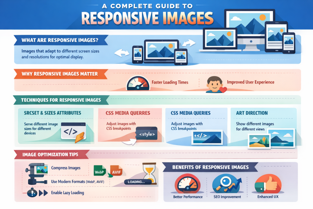
Responsive Images are a set of HTML attributes, file techniques, and delivery strategies that let browsers choose the most appropriate image resource based on screen width, pixel density, layout slot, and connection speed. The core tools:
- <img srcset> – list of image URLs with width or pixel-ratio hints.
- <img sizes> – tells the browser how wide the image will render in different viewport breakpoints.
- <picture> element – wraps multiple sources (JPEG, AVIF, WebP) with media queries for art direction.
- CDN / Client Hints – dynamic resizing, format conversion, and device-aware delivery.
Think of responsive images as a smart logistics network: tiny lightweight packages for cyclists on side streets, big bulk shipments for freeways, always just-in-time.
Where Responsive Images Fit in the Performance Workflow
| Stage | Image Focus | Business Win |
| Design | Sketch multiple crops/art-direction variants | Perfect composition on every screen |
| Build | Implement srcset, sizes, and picture | Automatic best-fit resource selection |
| Optimize | Compress & convert (WebP/AVIF) | 25–40 % smaller files |
| Deliver | CDN resize + lazy-load | Faster LCP, lower data cost |
| Monitor | Field data via CrUX, LCP alerts | Continuous Core Web Vitals health |
Well-tuned responsive images close the loop between UX polish and page-speed ROI.
Key Metrics That Matter
| Metric | Why It Matters | Healthy Target* |
| Largest Contentful Paint (LCP) | Google ranking & UX speed | < 2.5 s |
| Total Image Transfer Size | Data cost & load time | ≤ 500 KB per page |
| Wasted Bytes % | Oversized vs. rendered pixels | < 10 % |
| Hi-DPI Coverage | Sharpness on retina screens | 100 % key visuals ≥ 2× DPR |
| Bandwidth-Adaptive Success | Correct image served on 3G vs. Wi-Fi | 95 %+ |
*Benchmarks from WebSmarter site audits (2024-25).
Five-Step Blueprint for Responsive-Image Excellence
- Inventory & Classify Assets
Hero banners, product shots, icons—each needs unique breakpoints. Map design slot widths across breakpoints. - Export Multiple Variants
Generate 1×, 1.5×, 2×, and 3× widths and next-gen formats (WebP, AVIF). Automate with build tools (Sharp, Squoosh CLI).
Code with srcset & sizes
<img
src=”hero-400.webp”
srcset=”
hero-400.webp 400w,
hero-800.webp 800w,
hero-1200.webp 1200w”
sizes=”(max-width: 600px) 100vw, 50vw”
alt=”Hero showing product in use”>
- Add Art Direction via <picture>
Deliver alternate crops for portrait vs. landscape to keep focal points centered. - Layer Performance Enhancers
- Lazy-load (loading=”lazy”)
- Fetch-priority (fetchpriority=”high” for above-the-fold)
- Serve via image CDN (Cloudflare Images, Imgix) for on-the-fly resize & AVIF negotiation.
- Lazy-load (loading=”lazy”)
Common Pitfalls (and How to Dodge Them)
| Pitfall | Symptom | Fix |
| Missing sizes | Browser picks largest file | Add layout-based sizing hints |
| Over-eager DPR variants | Bloats data on slow 3G | Cap DPR sources at 2×, use save-data client hint |
| Heavy placeholders | Lazy-load jank | Use low-quality blurred SVG placeholders (<2 KB) |
| Art-direction neglect | Cropped faces on mobile | Use <picture> with media-specific crops |
| Format fallbacks ignored | Safari 13 fails AVIF | List WebP + JPEG fallback in srcset |
Five Advanced Tactics for Q4
- Image Component Libraries
Wrap best practices in a React/Vue/Svelte component—devs drop and forget boilerplate. - Client-Hint Negotiation
Use Accept-CH: Width, DPR, Save-Data headers; CDN auto-serves perfect fit. - Content-Aware Cropping
Leverage AI (Cloudinary Auto-Gravity) to center subjects in every crop. - Priority Hints
fetchpriority=”high” on LCP candidate, low on below-the-fold—browser scheduling magic. - AVIF First, Then WebP
type=”image/avif” source first; fallback to WebP/JPEG. Up to 50 % additional savings.
Recommended Tool Stack
| Task | Tool | Highlight |
| Batch Export | Squoosh CLI, Sharp | AVIF & WebP pipelines |
| CDN Delivery | Cloudflare Images, Imgix, ImageKit | URL params for width & format |
| UI Components | Next.js <Image>, Astro @astrojs/images | Automatic srcset generation |
| Monitoring | WebPageTest, Lighthouse-CI, CrUX | LCP + wasted-byte audits |
| Placeholder Gen | BlurHash, LQIP-modern | Micro-SVG preview under 1 KB |
How WebSmarter.com Delivers Pixel-Perfect, Byte-Light Images
- Image Audit Sprint – We inventory every asset, flag waste, and deliver a breakpoint & DPR matrix in 72 hours.
- Automated Pipeline – Custom webpack/Vite plugin creates multi-format, multi-size outputs, wired to your CDN.
- Component Drop-In – Our <SmartImage> React component enforces srcset, sizes, lazy-load, and priority hints—no dev guesswork.
- Real-User Telemetry – We stream LCP & CLS from CrUX to Looker dashboards; alerts fire when media regresses.
- Quarterly Tune-Up – As new formats (JPEG XL revival?) get support, we retrofit without codebase churn.
Average results: -42 % total image weight, -0.8 s LCP, and +19 % mobile conversion within the first month.
Wrap-Up: Shrink Bytes, Grow Business
Responsive Images are no longer “nice-to-have.” They’re the performance lever that safeguards search rankings, delights users, and lifts revenue—especially on mobile. Armed with srcset, smart CDNs, and a sprinkle of AI cropping, you’ll serve Netflix–level visuals without throttling load time.
Ready to make every pixel count?
🚀 Book a 20-minute discovery call and let WebSmarter’s performance squad refactor your images into a lean, revenue-boosting asset pipeline—before the next Google Core Update lands.
Join us tomorrow on Tech Tips Talk TV for another buzzword decoded—one term, one playbook at a time.

You must be logged in to post a comment.