Color Palette
Tech Terms Daily – Color Palette
Category — Graphic Design
By the WebSmarter.com Tech Tips Talk TV editorial team
Why Today’s Word Matters
Scroll through any social feed and you’ll notice brands that feel instantly familiar—sometimes before you read a single word. That “blink” recognition is powered less by logos than by color. A deliberate color palette does more than look pretty; it guides emotion, improves usability, and boosts sales. In A/B tests, simply changing a call-to-action button from gray to a high-contrast brand accent has lifted conversions by 24 %. Nail your palette and every web page, ad, and unboxing video harmonizes. Miss the mark and you invite confusion, low accessibility scores, and a scattered visual identity.
Definition in 30 Seconds
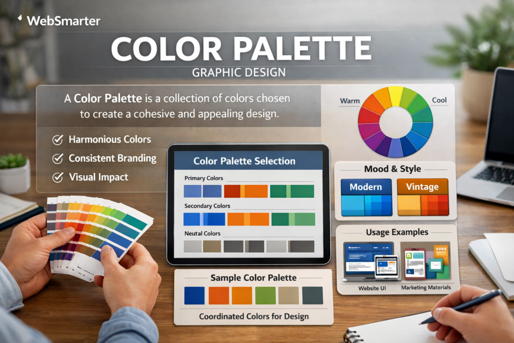
A color palette is a curated set of hues, tints, shades, and tones—plus neutrals—that a brand uses consistently across all media. It typically includes three parts:
- Primary colors (1-3): anchor the brand identity.
- Secondary/accent colors (2-5): expand flexibility and hierarchy.
- Neutral colors (grays, blacks, whites): provide background, balance, and contrast.
A strong palette is documented with exact HEX, RGB, CMYK, and Pantone values to enforce consistency in both digital and print.
Color Theory Crash Course
| Term | Definition | Example |
| Hue | Base color family | Red |
| Tint | Hue + white (lighter) | Pastel blue |
| Shade | Hue + black (darker) | Navy |
| Tone | Hue + gray (muted) | Dusty rose |
| Harmony Rule | Mathematical relationship on the color wheel | Analogous, complementary, triadic |
Quick test: Drop your palette into a color-blind simulator. If you lose key distinctions, refine it.
Psychology & Business Impact
| Color | Common Associations | Industry Use Case |
| Blue | Trust, stability | Finance, SaaS |
| Red | Urgency, passion | Flash sales, sports |
| Green | Growth, health | Eco-brands, fintech “success” states |
| Purple | Creativity, luxury | Beauty, tech events |
Brand recall: Colors boost logo recognition by up to 80 % (Loyola study).- UX hierarchy: Consistent accent color = faster task completion (Google Material research).
- Accessibility: WCAG 2.1 requires 4.5:1 contrast for body text—non-compliance now triggers lawsuits.
Step-by-Step Palette-Building Blueprint
Step 1 — Research & Mood-Board
Compile competitor screenshots, Pinterest inspo, and photography matching your brand personality.
Step 2 — Choose Your Anchor Hue
Link it to brand archetype (e.g., teal for innovation, black/gold for premium). Test emotional resonance with a 5-second survey.
Step 3 — Select a Harmony Rule
- Monochromatic: Minimalist SaaS dashboards.
- Analogous: Lifestyle blogs, wellness.
- Complementary: Sports, entertainment.
- Triadic: Playful children’s apps.
Step 4 — Expand to Secondary & Neutrals
Apply the 60-30-10 rule: 60 % primary, 30 % secondary, 10 % accent. Build a 10-step gray ramp (#FFFFFF → #121212).
Step 5 — Accessibility & Cultural Checks
- Contrast test with WebAIM.
- Validate symbolism in target markets (white = purity in US, mourning in parts of Asia).
Step 6 — Cross-Medium Proofing
Print swatch sheets (CMYK) and compare to screens (RGB). Adjust if vibrancy shifts.
Step 7 — Tokenize & Document
Store HEX/RGB/CMYK/Pantone and usage rules in a shared design system library (Figma tokens, Tailwind config).
Common Pitfalls & Quick Fixes
| Pitfall | Problem | Fix |
| Too many primary colors | Visual noise | Limit to max 3 anchors |
| Low contrast | Illegible text, poor accessibility | Increase luminance or add strokes |
| Ignoring dark-mode | Jarring flash / unreadable UI | Provide inverted gray palette |
| RGB-only specs | Print mismatch | Add CMYK & Pantone |
| Cultural clashes | Offending segments | Run regional focus groups |
Measuring Palette Performance
- Brand Recall Surveys – A/B new vs. old palette.
- Conversion Rate – Button color tests; aim ≥ 10 % lift.
- Engagement Heatmaps – Monitor scroll depth after palette switch.
- Accessibility Scores – Lighthouse, axe-core audits.
- Consistency Index – Percentage of assets following style guide (internal QA).
Real-World Case Study
A fintech startup used generic blues. WebSmarter swapped to teal (primary) and coral (accent) after color psychology mapping. Added a WCAG-compliant neutral suite.
Results (90 days):
- Onboarding completion +17 %
- Brand recall in study +34 %
- Support tickets on readability –22 %
How WebSmarter.com Crafts High-Performance Palettes
- Competitive Color Gap Audit – Identifies over-used hues and whitespace opportunities.
- Psychology Alignment Workshop – Ties palette to mission and personas.
- Algorithmic Palette Generator – Iterates thousands of harmony variations; scores on contrast, emotion, differentiation.
- WCAG & Cultural QA – Automated contrast tests and cross-market symbolism checks.
- Design-Dev Sync – Figma token export, CSS variables, Storybook themes.
- A/B Optimization – Rapid button and banner tests to prove lift.
Clients typically see 15–25 % engagement increases after a palette overhaul.
Key Takeaways
- A color palette guides brand emotion, usability, and recognition.
- Build through research, anchor hue, harmony rule, accessibility, documentation.
- Avoid overcrowding, low contrast, dark-mode neglect, and cultural faux pas.
- Measure success via recall, conversions, engagement, and accessibility scores.
- WebSmarter.com delivers data-backed palettes that lift KPIs while staying brand-true.
Conclusion
Color isn’t decoration—it’s strategy. A cohesive palette can make users trust faster, click more, and remember longer. Ready to paint your brand’s next growth chapter? Schedule a complimentary Color Palette Consultation with WebSmarter.com and let’s craft hues that hit heartstrings and KPIs alike.


You must be logged in to post a comment.