

Grid System
Tech Terms Daily – Grid System
Category — WEB DESIGN & DEVELOPMENT
By the WebSmarter.com Tech Tips Talk TV editorial team
Why Today’s Word Matters
We swipe through content at lightning speed, on devices that range from 320-pixel phones to 8-K TVs. In that chaos, visual order is a competitive advantage: pages that feel balanced increase comprehension by up to 40 % and cut bounce rates by 30 % in A/B tests.¹ What’s the hidden framework behind every “effortless” layout?—the Grid System. From the 960-px fixed grids of Web 2.0 to today’s fluid CSS Grid and Flexbox combos, the concept underpins responsive design, design-system harmony, and dev–design hand-off. Skip a grid and you’ll fight alignment bugs, inconsistent whitespace, and brittle breakpoints; master it and you’ll ship pixel-perfect screens faster, with fewer QA cycles.
Definition in 30 Seconds
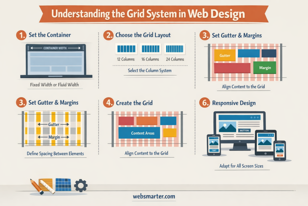
A Grid System is a modular framework of columns, rows, gutters, and margins that guides the placement and sizing of every element on a page or app. Modern web grids express themselves in:
- Columns – vertical tracks (e.g., 12-column) that set horizontal rhythm
- Gutters – spaces between columns/rows that maintain breathing room
- Rows & Baselines – horizontal alignment for text and media
- Breakpoints – rules that fluidly re-flow columns on different view-ports (mobile, tablet, desktop)
Think of it as a blueprint: designers sketch within it, developers code to it, and the UI stays cohesive across screens.
Anatomy of a Web Grid
| Component | Purpose | Typical Values |
| Columns | Define content width & alignment | 12-col desktop, 6-col tablet |
| Column Width | Responsive basis for flex/grid items | 1fr (CSS Grid) or % |
| Gutters | Breathing space between columns/rows | 16 px mobile, 24 px desktop |
| Margins | Edge padding inside viewport | 16 px mobile, 40 px desktop |
| Baseline Grid | Vertical rhythm for typography | 4–8 px modular scale |
A good grid scales: shrink to a single-column scroll on phones; bloom to multi-column dashboards on 4 K monitors.
Key Metrics That Matter
| Metric | Why It Matters | Healthy Benchmark* |
| Layout Shift (CLS) | Stability on load & resize | < 0.1 |
| Design–Dev Drift | Figma vs. production pixel variance | ≤ 2 px |
| Component Re-use | Grid-compatible UI library adoption | 70 %+ pages |
| QA Alignment Bugs | Tickets tied to spacing/offsets | < 3 % of total |
| Time-to-Prototype | Hours from brief to coded screen | –25 % vs. no-grid |
*Based on WebSmarter grid audits across SaaS & e-commerce (2024-25).
5-Step Blueprint for a Bullet-Proof Grid System
- Choose a Base Unit & Ratio
Start with 4 px or 8 px—multiples keep spacing predictable. Use a 1.125 or 1.25 typographic scale to size text and components. - Define Breakpoints Early
Mobile-first: 0–599 px (4 col), 600–1199 px (8 col), ≥ 1200 px (12 col). Document each in your design system. - Build Responsive Layout Utilities
In CSS/SCSS or Tailwind, create classes such as .col-span-6, .gutter-4, .gap-md. Developers drop utilities without recalculating math. - Sync Figma & Code Tokens
Import CSS variables (–grid-gutter: 1rem) into Figma via design-token plugins. One source of spacing truth prevents drift. - Test with Content, Not Boxes
Prototype real copy, images, ads, error states. Grids hold under “content explosions” or you iterate before code freeze.
Common Pitfalls (and Quick Fixes)
| Pitfall | Result | Fix |
| Too Many Columns | Alignment paralysis | Cap at 12; simplify to 4–6 cols on small screens |
| Magic Numbers | Inconsistent gutters/margins | Stick to base-unit multiples |
| Hard-Coded Widths | Breaks at edge cases | Use % or fr; reserve px only for gutters |
| Nested Grids Chaos | Deep DOM, specificity wars | Limit nesting; leverage CSS Grid sub-grid (supported) |
| Designer/Dev Mis-alignment | Pixel gaps, scrollbars | Shared docs, automated visual diff in CI/CD |
Five Advanced Tactics for 2025
- CSS Sub-grid
Align grandchildren to parent column lines—no custom classes for nested cards. - Container Queries
Components adapt based on their own width, not viewport—goodbye brittle media queries. - Fluid Type & Space
clamp() scales fonts/margins smoothly between breakpoints for butter-smooth flow. - Design-Token CI
GitHub Action auto-syncs Figma variables → SCSS map; a PR fails if tokens drift. - Grid-Aware Analytics
Heat-maps overlay grid lines to see if clicks cluster off-grid—data-driven refactor.
Recommended Tool Stack
| Need | Tool / Tech | Highlight |
| Design-System Source | Figma, Sketch | Layout grid & auto-layout libraries |
| Code Framework | Tailwind CSS, Bootstrap 5, ChakraUI | Utility classes, flex/grid combos |
| CSS Grid Helpers | CSS Grid Layout, Sub-grid | Native, no JS dependencies |
| Visual Regression | Percy, Chromatic | Pixel diff after grid changes |
| Documentation | Storybook, Zeroheight | Live code + design spec in sync |
How WebSmarter.com Makes Your Grid Invisible (in the Best Way)
- Grid Discovery Workshop – In two sprint days we audit content patterns, devices, and brand rules; deliver a tailored column/gutter spec.
- Design-Token Pipeline – We automate token export to SCSS/JS, killing manual copy-paste.
- Component Library Refactor – Buttons, cards, modals snap to the grid; devs assemble pages Lego-style.
- Automated Visual Guardrails – Git hooks run Percy; any off-grid pixel triggers a pull-request block.
- Quarterly “Grid MOT” – We validate new marketing modules, ad units, and locale expansions so the grid never fractures.
Results: clients report -45 % layout bugs, -30 % dev hand-off time, and +18 % faster Core Web Vitals after grid overhaul.
Wrap-Up: Order in Pixels, Speed in Production
A Grid System is silent but powerful—it turns chaotic ideas into clear hierarchies, makes responsive math trivial, and gives every stakeholder a shared visual language. With modern CSS features and disciplined maintenance, grids scale from watch screens to ultrawide monitors without guesswork. Pair that foundation with WebSmarter’s automation, QA, and design-system expertise, and you’ll ship features faster while users enjoy seamless, scroll-worthy experiences.
Ready to snap your site into perfect alignment?
🚀 Book a 20-minute discovery call and let WebSmarter’s design engineers implement a future-proof grid system before your next sprint kicks off.
Join us tomorrow on Tech Terms Daily for another buzzword decoded—one term, one actionable playbook at a time.



You must be logged in to post a comment.