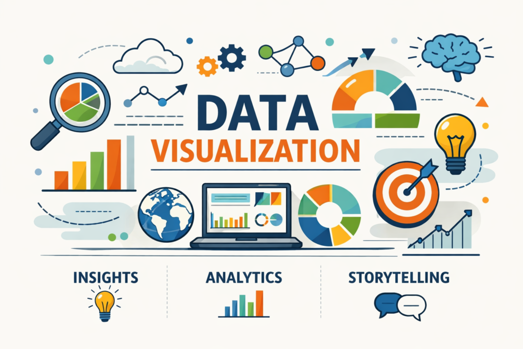
Data Visualization
Tech Terms Daily – Data Visualization
Category — A.I. (ARTIFICIAL INTELLIGENCE)
By the WebSmarter.com Tech Tips Talk TV editorial team
1 | Why Today’s Word Matters
Synthetic‐data generators, sensor networks, and LLM logs spew petabytes a day, yet executives still decide strategy in 30-minute meetings. Data Visualization (DataViz) bridges the gap—turning sprawling tensors and SQL joins into pictures the human brain decodes in milliseconds. A McKinsey study found teams that embed interactive visualizations into AI workflows reach consensus 2× faster and cut model-to-market time by 22 %. Meanwhile, regulators and customers now demand explainable AI; a clear chart often defuses “black-box” fears better than a 50-page white paper. Skip DataViz and you risk shipping under-trusted models, missed anomalies, and million-dollar misinterpretations.
2 | Definition in 30 Seconds
Data Visualization is the practice of translating data—structured, unstructured, or model outputs—into graphical formats that amplify cognition and communication. For AI, DataViz serves three tiers:
- Exploratory – Spot outliers, bias, feature correlation before training.
- Diagnostic – Inspect loss curves, confusion matrices, SHAP plots during modeling.
- Operational – Craft dashboards and storyboards that stakeholders use to make decisions on live predictions.
Think of DataViz as an AI interpreter: it converts machine patterns into human insight at speed and scale.
3 | Where Data Visualization Supercharges the AI Lifecycle
| Lifecycle Stage | Viz Type & Tool | Business Win | Example |
| Data Prep | Pair plot (Seaborn), missing-value heatmap (pandas-viz) | Detect bias & null islands | Gender imbalance in credit dataset |
| Feature Eng. | SHAP waterfall (Plotly), tsfresh feature importance | Justify feature selection | Prove “time-on-page” outranks “page views” |
| Model Train | Live TensorBoard scalars, weight histograms | Spot overfit early | Val-loss divergence at epoch 16 |
| Deploy & MLOps | Drift dashboards (Evidently), latency heatmaps (Grafana) | Prevent silent failures | Sudden spike in prediction delay in EU region |
| Stakeholder Storytelling | Explainer videos, interactive dashboards (Power BI) | Executive buy-in & action | Map showing fraud hotspots per ZIP |
4 | Key Metrics That Matter
| Metric | Why It Matters | Visualization Best Practice |
| Model Accuracy, F1 | Top-line model quality | Annotated confusion matrix w/ color scale |
| Feature Importance | Explainability & compliance | SHAP beeswarm or bar chart |
| Data Drift Score | Monitoring health | Divergence area plot over time |
| Latency & Throughput | SLA adherence | Dual-axis line chart (p95 latency vs. QPS) |
| User Engagement | Dashboard adoption | Heatmap of clicks & filter use |
5 | Five-Step Blueprint to AI-Ready Data Visualization
1. Nail the Question Before the Chart
Write a one-sentence purpose: “Show product managers which user cohorts cause revenue anomalies.” Everything—from chart type to color scheme—serves that question.
2. Follow the Data-Ink Ratio
Edward Tufte’s mantra: maximize “data ink”, minimize chart junk. Remove 3-D, drop shadows, and 75 % of labels; the pattern should pop unaided.
3. Encode Variables Intuitively
- Position & length ≫ area & color. Use X/Y axes for key quantitative variables.
- Stick to color-blind-safe palettes (85 M affected globally).
4. Blend Static & Interactive
Static PNGs freeze insights for reports; D3/Plotly dashboards let analysts slice by date, geography, segment. Provide both: quick scan + deep dive.
5. Automate DataViz in the Pipeline
Render charts in notebooks (Matplotlib/Altair) during nightly retraining, push PNGs to Slack, update Grafana/Looker tiles. Visualization becomes living documentation.
6 | Common Pitfalls (and How to Dodge Them)
| Pitfall | Effect | Fix |
| Rainbow color maps | Mislead viewers, exclude color-blind | Adopt sequential or diverging palettes (Viridis, Cividis) |
| Dual axes w/ different scales | Visual distortion | Normalize data or use small multiples |
| Overplotting in large datasets | Hidden patterns | Use density contours, hexbin, or down-sampling |
| Unlabeled baselines | Ambiguous message | Always mark zero or meaningful threshold |
| Dashboard sprawl | Stakeholder fatigue | Curate to “North-Star” metrics, archive unused tiles |
7 | Five Advanced Tactics for 2025
- Narrative DataViz with LLMs
GPT-generated captions auto-explain spikes and correlations in dashboards—faster decision loops. - AR Data Overlays
HoloLens or Apple Vision Pro renders 3-D point clouds of factory IoT data; on-site engineers walk through anomalies. - Privacy-Preserving Viz
Differentially private histograms let teams explore sensitive healthcare data without leaking PII. - Realtime Embedding Explorer
UMAP reduction streamed from vector DB shows drift in semantic space for LLM embeddings. - Code-Free Widget Kits
Low-code drag-and-drop (Observable Plot, Tableau GPT) democratizes viz creation for domain experts.
8 | Recommended Tool Stack
| Need | Tools (2025) | Why It Rocks |
| Notebook Prototyping | JupyterLab + Altair/Vega-Lite | Declarative, repeatable |
| Interactive Dashboards | Streamlit, Plotly Dash, Power BI | Python-first or enterprise scale |
| Monitoring & Ops | Grafana + Prometheus, Evidently | Live metrics & drift viz |
| Explainability | SHAP, ELI5 + Plotly | Rich interactive importance plots |
| Storytelling & Sharing | Observable Notebook, Datawrapper | Embed-ready, collaborative |
9 | How WebSmarter.com Turns Pixels into Profits
- Visualization Audit – 48-hour review benchmarks your current charts against best practices; finds hidden bias and misreads.
- Dashboard Design Sprint – UX, data, and execs co-create a north-star Looker board that slashes decision cycles –35 %.
- Auto-Viz Pipeline – We embed chart generation in your ML retraining DAG; nightly Slack digest keeps teams aligned.
- Explainability Layer – SHAP dashboards + narrative GPT blurbs satisfy auditors and non-tech investors.
- Enablement Workshops – Hands-on labs teach teams “chart literacy,” boosting self-serve analytics adoption +28 %.
10 | Wrap-Up: See the Signal, Skip the Noise
In the AI age, data without visualization is silence; visualization without design rigor is noise. Employ WPO-grade craftsmanship—fitting chart to question, automating updates, and engineering accessibility—and you turn big data into big decisions, fast. With WebSmarter’s audit-to-automation framework, your visuals become a strategic asset that accelerates innovation, earns stakeholder trust, and safeguards compliance.
Ready to make your data instantly understandable?
🚀 Book a 20-minute discovery call and WebSmarter’s visualization experts will design, embed, and operationalize a DataViz system that fuels AI-driven growth—before your next board deck is due.
Join us tomorrow on Tech Terms Daily as we decode another buzzword into a detailed, actionable playbook—one term, one measurable result at a time.


You must be logged in to post a comment.